Statement of intentions
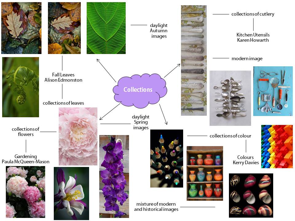
My starting point has been looking at the theme ‘Collections’ which has led to a range of ideas such as using nature to capture collections of flowers or leaves, as well as combining elements of colour within a range of different objects. I have also looked at collections of cutlery, to focus on light, shade and texture. I will begin by explaining how one photographer has influenced and inspired my work, including my thoughts and processes. I have taken photos of flower/plant collections and have produced a range of photographs that have informed my decisions about how to develop my work further. I aim to experiment with a range of materials and processes by editing my photographs on photo shop – this will allow me to alter the colour and also the exposure within my edits. I will further develop my work, making it innovative, as well as personal, realising my potential with final outcomes that show my developed ideas in an interesting way. Therefore, next I will replicate Paula McQueen-Mason’s work, by using the way in which she sets out her composition to inspire my own focus within the frame. This will allow me to use a variety of angles and levels, in addition to using the manual setting on my camera to ensure the focus is on the subject matter, whilst the background is out of focus. However, to add some of my own personal originality to the edits, I will use photo shop to edit and really enhance the colours of the plants and also flowers especially – personally, I believe this will make my images eye-catching within the composition.
Paula Mc-Queen Mason Karen Howarth Kerry Davies


Analysis of photographers
Paula McQueen-Mason
Within this photograph the subject matter is the crisp focus of a purple and white columbine flower within the composition. To describe this image I would use the words simplistic and also bold; this is due to the fact that there is only one main focus within the frame, leaving a very simple, easy image to observe. In addition, the moody purple and crisp white colours really contrast against the out of focus, deep green background – creating a high intensity of saturation. Within the background, there is very little for the eye to see, as it is completely out of focus; however, there is a hint of a very deep green colour and also a grey colour. Furthermore, the foreground is our main focus; here the columbine flower is positioned, whilst the camera is placed at a side angle to capture the side of this white and purple flower. Nonetheless, there is very little to see in the mid-ground – here there is a small selection of purple petals on the far side of the flower, which are slightly out of focus in comparison to the remainder of the flower. In my opinion, this image is more naturalistic than abstract. This is particularly due to the fact that the flower is completely natural and has not been manipulated in any way. However, it could be viewed as slightly abstract, since the focus has clearly been altered by the camera, to ensure the foreground is the clear subject matter of the composition.
Personally, I do not believe very many processes were used in order to create this image. This is particularly due to the fact that it’s quite a simplistic image, with the main focus just being the flower. Nevertheless, I think that this edit of the original photograph was produced using a C-type print to provide the very vibrant colours - these types of prints use at least three emulsion layers of light sensitive silver salts. During the printing, chemicals are added to form dyes in the emulsion layers. Overall, I think this process was used to create the really brash purple, white and yellow colours seen within the foreground of the photograph. Therefore, we are able to view this image composition as quite daring, with such bold colours. To me, this photograph reminds me of summer, since the flower and also bright colours symbolize the happiness, as well as bright sun associated with summer. As a whole, I would describe the tones as quite sombre shadings; these dark tones add an air of mystery, or potentially sadness to the composition (I will develop this idea more when I interpret the image). Furthermore, these dark tones can also add an almost three-dimensional appearance to the flower. As a result, the photographer has managed to capture the light against the dark tones, to make it appear as if there is light shining directly onto the flower (whilst the dark tones look like shadows). In addition, this image slightly differs from real life, due to the fact that the colours have really been enhanced by processes and also potentially, photo shop manipulations – this allows the subject matter to appear more bold and eye-catching. Personally, the feature that attracts me the most in this photograph is the crisp focus on the smooth texture of the flower. Overall, the camera settings must have been set on a very fast shutter speed to capture such a sharp focus of the tiny details of the soft texture within the subject matter.
Within this image, there is quite a small depth of field – it’s very shallow due to the important crisp focus on the flower. Overall, it’s split into two main sections, one filled with negative space, as well as one filled with positive space. Both of these types of spaces are just as significant within the composition. Firstly, the positive space provides the subject matter within the flower – this is the main focus within the image. Whereas, the negative space is just as important, due to the fact that it is out of focus, ensuring that the main focus is on the flower and doesn’t distract the eye from this. It contributes to the simplicity of the photograph, which represents the naturalistic appearance within the frame. Depth is also created by the perspective of the camera; it is positioned at a side angle to show the depth of the flower. In my opinion, the texture provided by the crisp focus within the image strikes me as the most interesting part – this is simply because this is what first attracts me to the photograph (see above paragraph). In addition, I have one key question regarding this image: what does the flower and its colours resemble? Flowers, as well as the colour purple are quite sombre features, meaning this image may represent the idea of death or illness. Therefore, I could research the history of the photographer Paula McQueen-Mason, in order to obtain information regarding any losses within her family/close friends. If there were, I could link this to the idea that the flower and purple could represent her mourning for these people. As a result, this would alter my understanding of the photograph, as it would possess quite a grave mood, to add to the beauty of the image. Finally, I would also like to question McQueen-Mason on what settings she used in order to capture such a sharp focus on the texture – did she also edit (in photo shop) on top of this to really enhance the image?
As I explained above, I would interpret this piece of art as representing the photographer’s sadness or mourning for a close companion/family member. I reached this decision due to the fact that a deep purple colour (seen on the petals) is a sombre colour – which can suggest a melancholy mood. Furthermore, flowers are often associated with funerals, which could also symbolize the passing away of a person. Therefore, both of these features could signify the sadness she feels about the passing of a close companion/family member. Alternatively, the deep purple could still represent misery, whilst the flower and also the flower could symbolize beauty, or purity. This is due to the fact that this flower is attractive, as well as the colour white appearing very pure and rich. Thus, the photographer may have used this to create the idea of her jealousy of another striking person. Consequently, a title such as ‘Loss’ or ‘Jealousy’ would easily signify the two ideas I have regarding the meaning of this image. Furthermore, to be a part of this photograph, it would feel quite simple/basic, since there is very little occurring within the frame. However, due to the sombre purple colour, it may also feel quite depressing – especially if either of my ideas regarding the meaning of the image were correct!
Overall, I believe this image is very effective. One key feature that contributes to this is the range of tones; the darkest value is in the centre of the petals. Moving out, the tone gradually becomes lighter, adding a clear three-dimensional appearance to the two-dimensional image. On the other hand, there could be more patterns within the frame. It’s very simplistic, thus, pattern would add an extra spark and softness to the overall composition. Linking to the previous point, other people may also think that this image is a little simplistic. This is particularly due to the fact that there is very little to observe. However, they may comment that the colours are extremely eye-catching, since they have clearly been enhanced by the process I previously commented on. In conclusion, this piece of art has taught me that the focus really influences how effective the final composition is. To have just a small section in clear, crisp focus draws the eye to this section – this enhances the subject matter further. Therefore, I will attempt to replicate this within my own work, by ensuring the shutter speed is fast to obtain that crisp focus. I think this will be effective, since it will allow me to capture the vibrant colours of the flowers (subject matter) with a very sharp focus!
Analysis of Karen Howarth
Within the frame of this image, I can see fifteen different pieces of cutlery, each piece sat horizontally within a vertical line. This photograph has clearly been cropped in photo shop, just so that the handles of the cutlery can be seen within the frame. Within the foreground, I can see each piece of cutlery and there is no middle ground. However there is a pastel green and yellow floral pattern on a dull, grey cloth in the background. In my opinion, I would use the words basic and also repetition. This is due to the fact that this photograph doesn’t look as if it has been edited (it’s very plain), as well as the fact that it has been arranged into a very orderly, repeated manner. I believe this orderly repetition pattern really compliments the floral patterned cloth in the background – thus, creating the main subject matter of the photograph. Overall, I believe this is a naturalistic image, since there is little, if no editing at all, to manipulate the image. Nevertheless, it could be slightly interpreted as abstract, due to the fact that each feature within the frame has been so carefully arranged to make the composition as interesting as possible. Personally, I think this pattern within the composition appears quite unusual, as there is so much to look at – especially since it’s all in crisp focus.
Overall, this image reminds me of a daily routine. I think this because it is very plain, repetitive and also orderly – very similar to a typical daily routine in the household. I also believe the cutlery symbolises this household theme. Furthermore, as I mentioned above, the two types of patterns within the foreground and background of this photograph really complement each other, since they provide a contrast in patterns to keep your eyes locked on the photograph. In addition, the colours are very light, as well as dull, so as not to divert the eye from the subject matter (pattern) within the frame. I believe the natural light within the photograph has been captured very simply; this is due to the fact that there are no obvious spaces in the photograph in which there is more light/shade, or any shadows surrounding the cutlery. Therefore, I think that the light is basically directed from precisely above the lens of the camera; this is so that there is no distraction from the basic patterns of the cutlery against the cloth in the background. Additionally, this light is clearly natural, since it appears to be very bright and also clear (whereas an artificial light would have a slightly yellow tint) – the direct level of this light could also indicate that the photograph was taken at midday, as there are no angled shadows beside the cutlery. As a whole, I believe this image clearly represents real-life, because it is very basic. There are no manipulations to the image to represent anything out-of-the-ordinary, since the main focus is aimed at the simplicity of the cutlery and the patterns. Finally, the framing of the image is what really interests me about this photograph. This is due to the fact that the overall image is very shallow and it’s all in crisp focus; in addition to the fact that there is very little negative space. Most of the space in this image is filled positively, providing a lot of features which draw the eye in.
Whilst understanding the image, I also analysed the space (above), since this is the factor that drew me into the photograph. However, the background really strikes me as the most interesting, because the patterned, soft yellow and green pattern (against the dull grey colour) contrasts very well against the basic shape of the cutlery. This works well, since if the cutlery possessed a more complex shape, this and the more complex pattern would really clash against each other – making the composition too busy. I would like to question Howarth regarding why she chose to photograph cutlery – what do the various pieces of cutlery represent? In addition, I would ask her exactly what processes or techniques she used in order to make up the composition, especially since it appears very basic (with a lack of editing). Although, I could research some of Karen Howarth’s work to find out how she composes her images, with the different processes/techniques she uses. Furthermore, I could research the previous work of Howarth, as well as background information regarding her life. This may indicate to me what the cutlery symbolises, in addition to how this image could link to various other images that she has produced (whether there is a theme to the collection of images).
In my opinion, a suitable name for this image is ‘Lifestyle’; this is due to the fact that the cutlery is a daily household item, which may symbolise the ordinary life of a person. On the other hand, it could be developed to ‘Life in a busy world’. I have interpreted it in this way, since the basic cutlery may still represent an ordinary life, whilst the busy, patterned cloth in the background represents the busy world we live in. Additionally, the different patterns that are embedded on each individual piece of cutlery could symbolise the uniqueness of each person in society. Thus, this is why I believe the cutlery could represent life (people) and also the patterned cloth represents the busy world. Nonetheless, the image is still quite basic/plain – other people may interpret it as appearing boring to observe. As a result, Karen Howarth may be implying that she believes life is very dull; she may be particularly suggesting this regarding her own life. The dull appearance of the photograph could potentially represent her feelings towards the life she leads. Finally, to be within the frame of this image, it may feel quite dreary, since there are no vibrant colours or textures. However, the patterns of the cutlery against the more complex patterns on the cloth could also make it feel very orderly and manipulated – since the cutlery has clearly been arranged within the composition.
Personally, as I mentioned whilst I ‘understood’ the image, I think the most effective feature of this image is the spacing, due to the fact that there is a great deal of positive space and very little negative space – thus, the composition is very busy to really draw the eye in. In addition, there is a very large depth of field, so it’s all in crisp focus; this is created by the fast shutter speed, to allow every feature in the image to be clear to view. On the other side of the argument, the Howarth could’ve manipulated the light a little more. By directing an artificial light at a side angle against the cutlery, the light would bounce off specific points on the cutlery. Overall, I believe this would create an effective, clear contrast between light and shade to add a real flair to Karen Howarth’s work – I will attempt to do this in my own photo shoot. In my opinion, I think other people would comment that this photograph is quite dull, due to the fact that there are no bright colours to attract the eye. Although, they may comment that the texture of each individual piece of cutlery is very detailed, in crisp focus (due to the fast shutter speed). Personally, I think the composition of the image is worth remembering, since there is a great deal of positive space – all in clear focus, as there is no tilt shift. Thus, it provides the viewer a lot to look at, especially the great amount of pattern created by the arrangement of the cutlery. To conclude, I have learnt that using pattern within the frame draws in the eye and really makes up for the little variety in colour, angles and also focus. As a result, I will attempt to replicate the use of pattern, by photographing the cutlery arranged in a pattern, against a contrasting patterned cloth in the background. However, to add my own individuality to the photo shoot, I will manipulate artificial light to direct at the cutlery. Overall, this will provide an effective contrast between light and shade – especially if I enhance this contrast through edits in photo shop.
Kerry Davies
Within this image I can see a selection of coloured pencils facing towards the camera lens – positioned in a messy arrangement. The focus of the image is on a few of the pencils in the centre of the composition, this is created by a central tilt shift. Therefore, this small selection of pencils (in crisp focus) in the centre is the foreground of the photograph. The remainder of the pencils out of focus around this central tilt shift make up the mid-ground of the image. Finally, the jet black colour, as well as the shadows against the faded white colour, provides the background of the composition – this is almost completely out of focus. Personally, I would use the words: rich and also divergent to describe this image, this is the subject matter. This is due t0 the fact that the colours on the tips of the pencils are very bold – rich in colour. Furthermore, the adjective divergent symbolises the fact that the rich colours are really distinctive in comparison to the jet black background/mid-ground. In my opinion, this is an abstract image, since the vibrant colours contrasting against the black background really add an unrealistic appearance to the image. On the other hand, it could be a naturalistic image also. I believe this, because the form of the pencils is very messy – as if it has just been thrown into a natural arrangement. Overall, the light appears very unusual to me. It seems to be an artificial light directed from a high level; I can perceive this since it appears to have been manipulated to direct onto the centre of the pencils (subject matter). As a whole, the pencils directed towards the camera lens create a three-dimensional effect – almost providing a texture to the image. Additionally, the artificial light enhances this effect, as it produces shadows under the pencils.
I believe various techniques and processes have been used to create this photograph. For instance-----------. Personally, this photograph reminds me of fireworks in a dark night. This is due to the fact that the pitch black background reminds me of the night sky, as well as the rich colours representing the variety of coloured fireworks. Consequently, I would describe the colours as intense and also animated, because they are so bright against the contrasting black background (similar to fireworks). I think these colours are very saturated; thus, they may have been edited in photo shop to really enhance the colours. As whole, this image slightly differs from real life (abstract), since the colours are far too saturated to appear natural or realistic. Furthermore, the pattern within the wooden section of the pencils has been really highlighted by the crisp focus of the central tilt shift (directed on the tips of the pencils); the artificial light has enhanced this since it provides a crisp view of this pattern. This lighting also enhanced the tones within the image, since it provides shadows – displaying a clear contrast between light and shade. Finally, I believe this light is very harsh and brightest in the centre of the image, since it really enhances the colours on the pencil tips. Overall, there is a very small depth of field within this image. I can see this because the centre of the image is in clear, crisp focus, whilst the bottom and the top of the image gradually becomes out of focus. In my opinion, this really draws the viewer’s eye into the centre of the photograph – where the colour has been enhanced most by the light. Personally, the contrast of colour is the feature that draws me in within this photograph. I believe this is really effective, since the jet black colour against the rich multi-colours appear very divergent against each other – this adds quite a contemporary theme to the image.
Space is represented quite well within this image. This is due to the fact that it’s quite a shallow image, meaning the focus is only directed on a small section of the composition (in a central tilt shift). Overall, I think this effective because it really draws the viewer’s eyes into this small section and highlights the saturated colours. There is also quite a lot of negative space within the composition. However, this is effective, as most of this negative space is a jet black colour – making the positive, vibrant colours really contrast against the jet black colour. Therefore, this negative space is what strikes me as most interesting as it really captures the eye. If Davies was here, I would ask her a couple of questions. Firstly, I would question what inspired her work with colour – was there a photographer that influenced this idea? In addition, I would ask: do the divergent colours represent anything (a particular mood)? I could research this to find out whether the contrasting colours represent a mood, or maybe a personal experience of the photographer. Furthermore, I could research the history, or personality of the photographer to discover whether the contrasting colours represent an event that Kerry Davies has experienced. This will assist me to understand her work and why she composes her edits the way she does.
Personally, I would provide this image with the title ‘Light in the dark’ or potentially, ‘Life in the night’. The title ‘Light in the dark’ really suits this image, due to the fact that the vibrant colours represent the idea of light. Overall, these rich colours represent the idea of light, since they are very bright and jump out at the eye; light can also be interpreted as a happy mood, thus, these colours create a happy mood. Additionally, the term ’dark’ can represent a depressing mood – this darkness has been symbolised by the pitch black background. Therefore, the name ‘Light in the dark’ can represent the idea of happiness within a depressing situation. Furthermore, the name ‘Life in the night’ can also symbolise the saturated colours against the pitch black background. This is due to the fact that the vibrant colours represent life, whilst the dark background symbolises the black night! In addition, there is a lot going on in this photograph – the natural arrangement of the image adds a very busy feel to the overall composition. As well as the light creating texture on the pencils, the composition of the pencils creates a rough texture (due to their three-dimensional effect). As mentioned above, I think this photograph is about happiness within a dark situation. This is particularly due to the fact that there are very saturated colours within a very dark scene. Overall, this may symbolise how Kerry Davies felt at the time of her photo shoot; she may have felt as if the environment she was living was very melancholy, whilst she felt a lot more content with her life. As a result, the rich colours may represent her and her mood, whereas the pitch black background may symbolise how the world appears to her (from Kerry Davies’ perspective). Therefore, to be inside this photograph would make me feel quite happy, within a depressing environment.
To conclude, the feature that I think is most effective within this photograph is: the artificial light directed onto the image from a high angle, as well as the central tilt shift really focussing on this section of light. This is due to the fact that it really enhances and also sharpens the three-dimensional effect of the pencils pointing towards the camera lens. As a result, it makes the viewer feel as if the saturated pencil tips are breaking out of the frame – which also highlights the saturated colours of the pencil tips. On the other hand, the least effective feature within this image is the lack of pattern. I believe that if the photographer arranged the pencils so that the coloured tips sat in an orderly pattern, it would look really interesting within the frame. In addition, it would really focus the viewers’ eyes on the saturated colours (subject matter) even more! Similarly, I think other people would be a little distracted by the lack of pattern (of the colours) – they would suggest that a pattern would make the composition even more interesting. In my opinion, the saturated colours are the feature that I will remember about this image. I think this because they really stand out within the frame, in comparison to other features such as the composition or the light. Overall, the work of Kerry Davies will influence me with my colour photo shoot. To replicate her work, I will increase the saturation of my edits within photo shop, to really enhance the richness of the colours. In addition, I will manipulate the camera settings to direct the focus on specific points within the frame. However, to add my own originality to the photo shoot, I will use a greater variety of angles compared to Davies, to obtain a range of perspectives of the objects I am photographing. Finally, by analysing this piece of art, I have learnt that contrasting rich colours against a jet black background adds an effective diversity to the composition – it also represents a clear mood (as I mentioned above) for the image.
