statement of intent
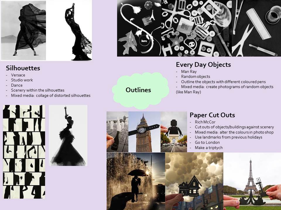
My chosen theme is ‘Outlines’; I chose this because I can really use the formal elements in my work, to enhance the outlines of shapes within my compositions. There are a range of ideas I intend to explore – that can be seen within my mind map. My first board will be based upon silhouettes, I will capture photographs of a dancer creating different body shapes and really emphasise the outline of her body by turning it into a silhouette. My second photo shoot will be based upon paper cut outs, I will cut out shapes of objects that have a personal meaning to me and place them in front of a suitable setting related to this object. Finally, my third photo shoot will be based upon day to day objects. I will use the dark room (studio) to create photograms of everyday resources, as well as take photographs of day to day resources and outline them with various coloured pens.
mind map
analysis of photographers
Rich McCor
Within this photograph, I can see the London landmark Big Ben in the mid-ground, with two fingers holding a pitch black cut out of a wrist watch, placed over the clock in the foreground. In the background, I can only see a bleak, cloudy sky. The camera presents this from a low level and a low, diagonally right angle. In his work, McCor uses scenery and then cuts a shape from black card to place over the landscape within the frame; this enhances the shape and also particular objects within the frame. Overall, I would use the words: creative, abstract, but also simple, to describe this image. This is due to the fact that the idea of using paper to add to the shape and space of the image is very original, as well as abstract appearing. However, to create the image, it must have been very simple, as all McCor did was use his artistic ability to draw and cut out the outline of a wrist watch, then add it to the composition of the Big Ben clock. I think this is a naturalistic image, since it uses an infrastructure situated in London, as well as paper overlapped on it – there are no special edits, mixed media, or photography techniques involved. However, it could be abstract, since the additional paper shape of the wrist watch adds an unusual perspective to the image. Within this image, the use of (the formal element) shape is quite familiar, because there are lots of geometric, as well as organic shapes. For example, the outline of the clock makes an organic shape – it’s very smooth and soft. Whereas, the outline of the building and the ends of the wrist watch possess an outline that creates a geometric shape. This is quite straight edged, which really contrasts against the more rounded shapes – adding an interesting diversity to the image. However, what I find quite unusual within the composition is McCor’s use of texture. The whole of the composition is in crisp focus, meaning the texture of Big Ben is crisp and clear; it almost appears as if it has been sharpened and refined using a short exposure.
The equipment used to create this image is only a camera, as well as a piece of black card/paper cut into the shape of a wrist watch. The outline of this paper/card enhances the shape and also importance of the Big Ben clock face. This photograph reminds me of a normal day out in London, since the image is so simplistic that it only highlights the size and shape of one of London’s most historical landmarks. As a whole, I would describe the lines as very straight and orderly. However, the line surrounding the clock face is very smooth and circular – which emphasises the importance of the clock face. The three dimension appearance of the structure possesses a variety of similar, rigid lines that create a repetitive pattern on the surface of the tower; this pattern also creates a rough texture against the surface. In addition, the tone within this image varies. The lightest value can be seen in the background of the image, in the sky and in the foreground, on the clock face. The value of tone becomes darker on the surface of the tower; however the darkest value is on the pitch black cut out of the wrist watch. Personally, I find the range in the value of tone effective, since they really contrast against one another. Rich McCor has captured the play of light in this image, because the background of the photograph (sky) is very bright and light, in comparison to the darker tower and also the even darker black cut out of the wrist watch. Therefore, this clear difference between the naturally lit background and the structure in the centre really emphasises the outline of the landmark: Big Ben. Furthermore, McCor’s use of light is also very harsh, as it allows the viewer to obtain a clear view of the pattern and texture created by the lines. For me, the angle in which the composition has been captured is the most interesting part of the photograph. This is due to the fact that it highlights the great height and also the three dimensional shape of the Big Ben tower.
In my opinion, the representation of space within this image is quite interesting; there is quite a lot of negative space, which is the sky in the background. However, this just allows the viewer to focus on the small amount of positive space, which shows the subject matter of the shape of the tower, as well as the shape of the wrist watch paper cut out. In addition there is a very small depth of field, since just about the entire photograph is in crisp focus. If Rich McCor was here, I would ask him a couple of questions about this piece. For example: I would ask him what gave him the idea to cut paper into shapes and overlay it in front of a landscape or scenery. In addition, I would ask him what the reason for the emphasis of the clock is – does time represent something meaningful to him, or could he just particularly like the Big Ben landmark? Therefore, through research I would like to discover whether something has occurred during his past which could cause him to signify the idea of time.
Personally, there are two titles I would give this image; either ‘A moment in time’ or ‘The outline of a day’. This is due to the fact that the two shapes of a clock within the same frame emphasise one particular time of day – hence ‘A moment in time’. Alternatively, the fact that the wrist watch cut out outlines the clock face, illustrates a day passing – ‘The outline of a day’. Furthermore, there is not a lot going on in this image, since the use of focus is very plain – there’s no complex vignette, or tilt shift. The whole of the image appears in clear focus, as McCor is attempting to solely focus on the shapes and also viewpoints within the composition. I believe this image is particularly focussed on time, or potentially a historical occurrence within Rich McCor’s life. I came up with this idea because there is very little positive space filled within the composition – this positive space presents two forms of time (a wrist watch and Big Ben). Therefore, McCor may have made this photograph to signify something that happened in the past; the tones are also of very light values, which could connote that this historical occurrence is a happy memory for McCor. Overall, to be within this composition, it would feel very orderly. This is due to the fact that the repetition of the straight, three dimensional lines (to create a pattern) on Big Ben, adds a sense of calm and order to the photograph.
Finally, I believe that the use of angles in the framing, as well as the use of shape is quite effective within this photograph. McCor’s use of angles adds a perspective to the Big Ben clock – emphasising the height and also importance of the clock (thus emphasising a significant point within the photographer’s life). Overall, the importance of the clock is what I will probably remember about this image. In addition, the contrast in the value of tones between the foreground (wrist watch cut out), mid-ground (Big Ben) and also the background (lighter sky), really highlights the outline of the shape of the clock tower and the wrist watch. Although I don’t think the photographer’s use of depth of field worked too well, since the whole image is in focus, meaning there is no sense of mystery to the image. Within my photo shoot, I will respond to the stimulus of shape, by creating paper cut outs of objects that have a personal meaning to me and placing them over a landscape or setting that relates to this object. To summarize, from exploring this piece of work, I have learned that a very quick exposure to create a tiny depth of field, allows the viewer to focus on the subject matter in the composition – rather than being distracted by a complex focus.
Versace
Within this photograph, I can see the posture of the silhouette of a woman with her left arm extended, wearing a feathered dress, positioned slightly to the right of the centre of the frame (in the foreground). Her figure is completely black, which contrasts against the bright light value of the background. The words I would use to describe this photograph are: mysterious and also curvy. This is due to the fact that the body language that the woman demonstrates is very elegant looking, as well as the fact that her facial expression appears quite moody – this adds an air of mystery to the image. In addition, her posture is not very upright; it’s slightly tilted towards the centre of the composition. Overall, this tilt creates very natural curves in the woman’s body. If I was to describe this image to someone that had not seen it, I would start off by stating that the background consists of an extremely bright, white colour – with no shadows. There is no mid-ground; however in the foreground, a woman is positioned to the right of the frame, leaning towards her right (to the centre of the image). The woman wears a long black dress that clings to the body, with feathers coming out from the bottom of the dress. Her left arm is extended above her head and her right hand clutches the elbow of her left arm. In front of the woman, there is a slight shadow that contrasts against the white background. Overall, I think this is an abstract image, due to the fact that the woman has manipulated her body to curve in a very unnatural way. Although, I find Versace’s use of focus quite original, as the viewer is unable to determine whether the background is in or out of focus; however, the silhouette of the woman is in clear, crisp focus.
To create this image, I think Versace used a short exposure, since most of the image appears to be in clear crisp focus. The resources used include: a camera, a white studio backdrop and also a long, floating black dress. This helps to emphasise the silhouette of the black dress against the diverse, white backdrop. Overall, this image reminds me of a modelling catwalk, since the mystery of the woman’s silhouette appears very elegant within the frame. I think Versace’s use of line is quite effective, as the outline of the woman’s silhouette creates a range of interesting curvy lines – which emphasises the shape and outline of her posture. Thus, most of the shape appears organic, highlighting the mystery of the silhouette. Although this image is in monochrome, I find the contrast between the values of tones quite striking. This is due to the fact that the difference between the (white) lighter value in the background and the (black) darker value in the foreground is very sudden, which emphasises the outline of the silhouette. There are no textures to be seen within this photograph; however there is a slight pattern on the material of the dress which repeats itself. The bright light tone also seeps through this pattern to enhance its effect on the dress. Versace captured the play of light within this image, as there is a lot of bright, artificial light coming in from all directions in the background, which adds a harsh look to the silhouette of the woman. In addition, as this light is so bright, it creates a small shadow in front of the silhouette of the woman – this also shows that the light is directed in from behind her body. Personally, Versace’s use of the difference between light and shade in the foreground and background is the most interesting feature, because it really highlights the outline of the silhouette created by the woman’s figure.
There is more negative space in this composition than positive space; the outline of the silhouette makes up the positive space, which is effective, as this shape is the subject matter of the image. Versace used the rule of thirds very well; she directed the woman just off the centre of the framing, to ensure she wouldn’t be placed in the centre and distract the viewer from other features in the space (such as the background). As far as I can see, there is a very small depth of field, since the whole photograph seems to be in crisp focus. However it’s hard to tell, since the white background is so intense – it’s hard to see whether it’s in or out of focus. I also really like the intensity of this background, as it really enhances the effect of the contrasting, pitch black silhouette. If Versace was here, I would ask her whether the woman in the image represents anything significant – for example, women’s rights. In addition, I would ask her if she used a bright studio background to create the intense white background, or if she used photo shop to create it? Therefore, through research I would try to discover whether Versace has any strong views on women’s rights; this would allow me to discover the meaning of the significant outline of the woman in the composition.
I would give this image the title ‘Mystery’ or ‘Monochrome’. This is due to the fact that the silhouette of the woman’s body creates a very unusual stature, adding a sense of mystery to the image. In addition, the clear contrast between the black silhouette and the bright white background, as well as the lack of other colours, creates a monochrome effect. There is not a lot going on in this image, since the very little positive space (taken up by the silhouette) is still – Versace didn’t capture movement within the frame. Thus the composition is manipulated to appear very unnatural, as the woman has been placed into a certain posture. Overall, I think this image could be focussed on women’s rights – since the camera is solely focussed on the outline of the woman, which is quite simplistic. This could mean there is significance to the woman. Due to the fact that she has one arm raised, could connote power or conflict regarding the woman. Women’s rights are often symbolised by power or conflict. To be in this image would be quite dark, because the contrast between the light values and the dark values really enhances the pitch black silhouette, adding a dark, eerie effect to the photograph.
Personally, I think the contrast between the light and shade between the foreground and background is the most effective feature within this image. This is because the intense background really enhances the outline of the silhouette – which is the main basis of this theme. Overall, this is what I’ll remember about this photograph. Whereas, I don’t think the large amount of negative space is effective, since there’s not a lot for the viewer to look at in the frame. Thus, it makes the image slightly boring. I think other people would say that this image is quite mysterious, due to the fact that the woman’s figure is quite abstract and unusual, creating mystery. When responding to Versace’s work, I will replicate her use of the varied body positions to create an interesting outline. However, to add my own originality to the photographs, I will use a different background – to possibly add more of a context, or a story to the photo shoot. From exploring this piece of art, I have learnt that a contrasting background further highlights the outline of a silhouette.
Man Ray
Within this image I can see a photogram of daily objects; these objects are a bright white colour against a pitch black background. To describe this image, I would use the words contrasting and also simple. This is due to the fact that the white photograms are really diverse compared to the black background. In addition, the use of daily objects is quite simple – since they create a basic outline (with no abstract textures or patterns) to provide the subject matter. To describe this image to someone that has not yet seen it: the background is pitch black, with a vignette effect in each corner – where it fades out to white. There is no mid-ground, but in the foreground, there are many daily objects in the form of various values of white/grey shapes. For example, taking up most of the space in the centre is a long rose, with a bright white value that gradually fades to a darker, greyer value on its ends. To its left in the bottom corner, there is a large leaf of a slightly darker grey value; this is beside a lighter value of the word ‘here’. To the right of the rose in the top right corner there are four shapes – a video tape, the Eiffel Tower (the lightest value), a shell and a flower (the darkest value). Overall, this image is slightly natural, since the shapes are ordinary objects; however, it’s slightly abstract due the really sudden contrast between the monochrome tones (the background against the foreground). I do find however, it quite confusing how Man Ray made this photogram – which I hope to learn through my own work.
Equipment used for this photograph is the equipment listed above, as well as a camera. However, Ray used a photogram process to create this image, using a dark room to lay printing trays in a row beside a bucket of water. Generally, he then would’ve exposed the paper to light with different objects to create a photogram. Thus, this affects the way in which we view it, since it really emphasises the boundary between the outline of the objects and the background. Overall this photograph reminds me of youth, as young children like to go out and collect objects, such as those seen in this composition. In addition there are multiple lines in this photograph, created by the boundary between the outline of the objects and the dark background, as well as lines created by the objects in the photogram (such as the leaf). Some of these are curvy (on the edge of the rose), some are straight (on the edge of the video tape), some are thicker (those on the structure of the leaf) and also some are thin (around the edge of the leaf). Therefore, the curvy lines create organic shapes, such as on the rose; the straight lines create geometric shapes, such as on the video tape. As a result, this provides a range of different shaped outlines. Due to the fact that this is a photogram, there is no colour – it’s in monochrome. However, there are lots of tones in this monochrome effect. The large rose in the centre is of the lightest value, although the edges vignette out to a slightly darker tone. The darkest value is in the background, as it’s pitch black – which really contrasts against the lighter values of the objects. There aren’t really any textures or patterns within this composition, since the contrasting light of the photogram creates only an intense solid white or black colour. Ray has really captured the play of light in this photograph, particularly because it’s a photogram; the artificial light in the darkroom ranges from a dark value to light value in various places in the frame. This light is harsh all throughout the image, but fades out to soft in the edges of the frame. Overall, the mysterious monochrome effect is what interests me most in this photogram.
There is a lot of positive space within this composition, taken up by the light valued objects in the photogram. Whereas, the pitch black background represents the very little amount of negative space. There is no depth to this image, since it is a photogram, but the rule of thirds has been used well - each section of the photogram is occupied by another object to interest the viewer. Personally, the contrast between the light and shade between the foreground and background, strikes me as one of the most interesting features within this image. This is because it provides a diverse, harsh effect that really draws the viewer in. If Man Ray was here, I would ask him whether any of the objects represent something meaningful to him, to discover the mood or theme of the image. I would also ask him if he edited this image further to really enhance the light and shade effect. Thus through research, I could discover any significant events in Ray’s life, which may relate to one of the objects within the photogram.
I would give this image the name: ‘Diary’ or ‘Memories’. This is due to the fact that a diary recalls different parts of your day; thus each object within the frame could represent something that happened within Ray’s day. For example, the leaf could show a point in which he took a walk outside. Similarly, each object within the frame could represent a memory within Ray’s life. For instance, the Eiffel Tower charm could represent a time in which he visited the Eiffel Tower in Paris. As a result, this photograph could be about significant days within his life (either positive or negative), that Man Ray wanted to represent within a photogram. Thus, depending on the meaning, this image could create either a positive or negative theme; to be inside this photogram, would provide a very strong positive or negative mood. Overall, I believe that Ray made this photogram to remember significant points within his life.
Personally, I think that the sudden contrast between the bright white/lighter grey shapes in the foreground against the pitch black background is the most effective feature of the image. This is due to the fact that it adds a harsh diversity to the image that really pulls the viewer in – I believe this is worth remembering about the image. In contrast, I think the least effective feature could be the lack of colour – potentially one colour added to this composition could a really striking effect against the dull monochrome effect. I think other people would question the meaning of the image, since the choice of objects is unclear. Thus, if Man Ray linked these objects, his photogram would have a clearer meaning to provide an obvious theme to the image. When responding to this image, I will create photograms that contain objects that are meaningful to me, or that suit a particular theme (for example, nature). I will also further develop this photo shoot by photographing other daily objects (not photograms) using a variety of angles – I will then hopefully edit these to monochrome and use mixed media to outline shapes in certain colours.
